Sunday, December 14, 2014

Why Russian Crisis of 2014 is Not the Same as Crisis of 2008-2009?

Some consider current crisis in Russia as no different from one suffered during and after financial crisis of 2007-2008. In fact, the culprits are falling oil prices and the total collapse of large financial institutions repeat themselves: oil prices are falling again and Western sanctions against Russia simulate the latter. The effects on Russian economy look like before too: Russian currency - ruble - keeps falling against dollar and Russian economy is heading for recession - just like in 2d half of 2008. But is it really the same kind of crisis for Russia?

This simple comparison bar chart tries to address this question by looking at 3 things: how much oil prices fell, how much ruble lost against dollar, and how much reserves Russia had at the beginning of each crisis.


The crisis of 2014 is still unfolding which makes this chart even more telling. Ruble fall is already far ahead of total loss in 2008-2009 (red bars). At the same time, this year oil prices fell just a fraction of total loss in 2008-2009 (blue bars). To top it off, Russia had 100,000 million USD more in reserves before crisis in 2008 than it had in August of 2014 (green bars). I suspect there are other different things at play in 2014. What are they?

Data (updated on Monday, December 15th):
2014: from June 20th when oil peaked to Monday, December 15th. Reserves Central Bank held in 2014 were the largest on July 1st.
2008-2009: rather conservative dates from July 3d (when oil peaked) to February 18th, 2009 (when ruble began stabilizing along with oil prices). Reserves were largest on August 1st.
Oil prices: for WTI.

Sources:
1. WTI Daily Prices
2. RUB to USD Historical Exchange Rates Daily
3. USD and Gold Reserves by Russian Central Bank

Saturday, September 13, 2014

Crime Different as Night and Day

Dallas Open Data has among others data set of Dallas Police reports with narratives from October 2013 to May 2014 totaling over half a million reports. By focusing on text fields with crime description and narrative from these reports I will plot several (not completely unexpected) text-based visualizations.

First approach associates each police report with one of logical text corpora to display wordclouds of most frequent terms. Rules defining text corpora may be based on time, location, gender, race, etc. To illustrate I define 4 logical documents - Night, Morning, Day, and Evening - by dividing 24-hour day into 4 segments: Night (reports with time of offense from midnight to 6 a.m.), Morning (time of offense from 6 a.m. to noon), Day (time of offense from noon to 6 p.m.), and Evening (time of offense from 6 p.m. to midnight). This results in 4 clouds displayed in pairs of opposing times: Night vs. Day and then Morning vs. Evening:

At night we are looking at ASSAULT, VEHICLE, and FLED, while day is about SUSPECT, THEFT, and NFI (No F...ing Idea). Not sure what CAUSING and CONSENT mean on top of the Night, but PAIN there makes sense. Evening and Morning seem to differ the most on ASSAULT and BURGLARY.

Another way to look at the same data is with slopegraph (example): terms (rows) moving up or down according to their frequency across 4 logical document (columns), but I am leaving this for my next post.

Unstructured data as text can still utilize types of plots usually associated with structured types. Bar graphs (histograms) by hour of day for reports with certain term is one way to achieve this. To illustrate let's count police reports with term BURGLARY for each hour (from 0 to 23) across all data (roughly 6 months). This results in the following plot:


Not exactly surprising but it offers several conclusions, for example: most burglar's work day starts at 9 in the morning until 10 in the eveining. They also have lunch break at about 3 p.m or possibly it's police officers who do. Finally, high peak at 5 is something everyone should be aware of unless, again, it's police officers who skew the time of offense in reports towards the end of their shift.

Different trend can be observed for reports containing BMV (Burglary Motor Vehicle):

At first, it's rather surprising to see the peak in the morning hours, since we expect this type of crime happening at night. But, likely, victims find out about this type of trouble only in the morning and police has no better time to report offense.

Last graph is for term ASSAULT:

This crime obviously gets reported by victim with good knowledge of when it took place. ASSAULT crime reports peak between 9 in the evening and 1 in the morning significantly cooling off by morning hours. I would like to see promoting of good night sleep as a crime prevention program some day.

Friday, August 8, 2014

The Good, the Bad and the Ugly: Where Russia Stands on Banned Foods

Russia responded to sanctions by banning western food imports. Supposedly the government hand picked products that should not immediately harm Russian economy and consumer.

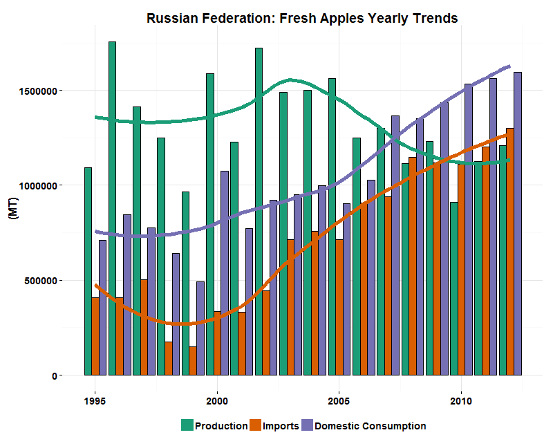
Big question in Russia is deciding between production or replacing importers or both at least for one year while ban is active. Below I plot trends of Domestic Consumption, Production and Imports by Russia for last 20 years or so for some of the banned food groups. These are total numbers across all importers and my goal was to see when Russia can make leaps towards production and where it will likely look for new import partners. I also hope that economists may find this information helpful to assess impact on Russian consumer and economy.

The Good


Chicken, pork, and turkey meats are doing great. For all 3, growing demand is met with growing production and at expense of diminishing imports. Turkey industry in Russia is simply experiencing Renaissance - too bad it's relatively unpopular among consumers. All 3 are good choices to ban imports to further convince domestic producers to invest.

Fish and seafood demand is fully met by production, but picture is distorted due to variability of products inside this food group. Probably, imports of higher end products such as Norwegian salmon will not be easily replaced.
 
I suspect that Milk (non-dry) is not import heavy product so there is nothing to worry about (on both ends of the food ban vs. sanctions chain). We'll see quite different picture with dry milk later.

The Bad

Everyone in Russia talks about beef from Brazil and Argentina nowdays and this chart clearly shows why. Both import and production trend lower with decreasing demand with import not very far below production. Russia will be looking for replacement of banned beef elsewhere, probably in Latin America.


All 4 dairy food groups above show clear sign of replacing production with imports in last 10-20 years with 2 Dry Milk groups at worst. Import trends go up despite stagnating demand. Russian producers of milk products and retailers will be looking for new importers unless the government will reverse trend in falling domestic production.

The Ugly


Fresh fruits will come from Turkey or China or somewhere but not from Russia. The only group that shows production growth is grapes but it's clearly too low.

I picked pistachios because almost everyone loves them and they were on the list of banned foods. Good luck to find them in Russian stores in a few weeks and my sincere sorry to high-end chefs who will miss them from appetizers to desserts.

The Cherry Orchard 


Fresh Cherries (both sweet and sour) is a food group which associates with "The Cherry Orchard" - the last play by Anton Chekchov. You can read the play or look at the chart... and then read the play.

On more food groups and countries involved into Russia's Food Ban see my interactive infographics. Conclusions made are my subjective opinion. I welcome any comments and/or corrections.

Sources: Index Mundi  and United States Department of Agriculture.

Friday, March 28, 2014

Word clouds of Putin Address

Yet another turn of events took place today with Putin phoning Obama to seek diplomatic solution to the international standoff over Ukraine. Neither side expressed much excitement so far, but dialogue during crisis is better than couple of monologues.

Meanwhile what drove Putin to reach out to Obama? Maybe he feels it's the time he holds all the cards? While easily guessing his cards are Crimea, military buildup on the border, and continuing instability in Ukraine, what would be the bargaining about?

I will try using simple text analysis give another perspective on Putin's campaign in Crimea. Russian president doesn't give speeches or  press-conferences often but always exceptionally prepared. There were 3 relevant appearances by Putin in last couple of months before and during Ukrainian crisis (all are official translations from his site):

  1. News conference following EU Summit on January 24th.
  2. Press-conference with media representatives to answer questions with regard to the situation in Ukraine on March 4th. 
  3. Address by President to State Duma on Crimea on March 18th.
So what is the Address on Crimea about:
Not surprisingly it refers to Ukraine, Crimea and Russia the most. These words could be excluded without loosing any insight: 
Now, cloud becomes all about will and people (supposedly applied to RussianUkrainianCrimean). Has anything changed since EU Summit when Putin made his address? One way to answer this is to place both transcripts into the text corpus and run TF-IDF statistic on the terms. This time our cloud is based on the TF-IDF scores (minimal frequency of term per document is 3) for the address and will reflect both frequency in the Address and importance compared to EU Summit (that is all other documents in the corpus):
The words above stand out when compared to EU Summit text. It's no surprise that Sevastopol didn't sound in January, but nor were Kosovo, residents, and law. To make it more convincing let's throw into the mix Putin's press conference on March 4th when he broke silence on Crimea. Now the text corpus includes 3 documents and this is the cloud of the highest TF-IDF scores for the Address document:

Again there are Sevastopol and city, but also importantly Russians, NATO, millions, ethnic, reality, Tatars, borders, and USSR are the words that stand out compared to what Putin said before. It is a clearly a mix of his concerns, goals, and, well, realities, but, it could be also about symbol of Russian glory - Sevastopol - at least to some degree? After checking his speech it is clear that he referred to Sevastopol each time Crimea, but there was one place where this city mentioned alone: 
"I simply cannot imagine that we would travel to Sevastopol to visit NATO sailors."
Would Putin roll back and yield to international condemnation? Very unlikely, but I cannot imagine at all he will give Sevastopol back.

Since Sevastopol was used along with Crimea which was removed from analysis the cloud below is version of last with Sevastopol excluded. Word clouds are always open to interpretation so I leave it here for the reader to make their own conclusions:

Wednesday, February 26, 2014

Deconstructing The French Laundry Wine List, Part II

Having more refined data than last time I focus on prices in this post.

Price Word Clouds 

Word clouds below use prices instead of frequency: size corresponds to average price of bottles of wine each term belongs to (hence, even if expression occurs only once but in very expensive wine it appears on top):


Let's remember that Domaine de la Romanée-Conti is less expensive than Château Petrus. Next, let's zoom in by splitting this into two clouds: for red and for white wines (some names will disappear from both because they don't belong to neither reds nor whites, e.g. Scion which belongs to fortified wines).

Red wine price cloud (1287 bottles total):


Now both Domaine de la Romanée-Conti and Château Petrus are first among equals. The hint why the former improved lies in the white wine price cloud (539 bottles total):
The Burgundian estate is present here but not so for the one from Bordeaux. It'll be shown momentarily that the prices of whites are consistently below reds so averages tend lower when computed across the board. This effect is not present for Château Petrus as it doesn't feature whites at all.

Last cloud for today is whites price cloud without outlier Domaine de la Romanée-Conti. Removing it makes viewing prestigious whites on The French Laundry list almost as pleasant as drinking (just kidding):
    

Gender Wine Inequality between Reds and Whites

Are whites cheaper than reds? Using population pyramid type of histogram we can compare them by price (think of white as female, red as male (or vice versa if you wish), and wine price as salary). And just like in population pyramid we have plots for each country (France, Italy, and US):

US makes the best case for inequality while France fares best for equality (longer history of wine democracy?). All 3 show consistent trends though: red prices are right skewed with fat tails, while white prices are more symmetric with lower centers of distribution. Of course, all results are subject to The French Laundry sommelier's bias in wine selection (and possibly the reason that Spain was heavily under-represented in whites so it didn't make this chart).

Compare median prices (dashed horizontal lines) across 3 countries: contrary to popular belief American wines are better value than European counterparts (assuming that all wines on the The French Laundry list are outstanding). American wines really represent the "budget" section of the list (prices under $200) while Europeans peak above $200. I will follow up on that in the future posts.

Sunday, February 23, 2014

The French Laundry Wine List Deconstructed

Not that I surprise you but my little exercise in deconstructing The French Laundry wine list  may help with planning your trip there. This word cloud is from the wine list offered by the restaurant (available here):
It includes expressions parsed from the wine names. Terms that occur less than 5 times were excluded.

Wine names usually do not include varietal, country, appellation, and other standard designations. But some exceptions do occur, so below is the same cloud with top exceptions removed:
Apparently, Domain de la Romanee-Conti is a big winner for Head Sommelier Dennis Kelly. This estate in Burgundy produces some of the world's most expensive bottles of wine.

What vintages are in favor at The French Laundry today?
I did hear that 2010 was a great vintage in California. Is it really American wines that contribute to 2010 success? Next 6 vintage clouds are by country:
Indeed, 2010 is popular in USA today, but so is in France, Germany and Austria. Noticeably, sommelier favors 1996, 2004, 2006 in Italy, 1994, 2004, 2005 in Spain, 2005 and 2009 in France, 1996, 2004, 2006 in Italy.

And, finally, let's see wine price histogram:
Selection peaks around $150 to $200, with plenty of choices in $250 to $500 range still. In case you started to worry, I removed wines with price tag above $2000 to improve this chart: there are plenty to choose above $2000, especially the wines from Domaine de la Romanee-Conti.

P.S. Found nothing worth trying or prices are too high? Feel free to bring your own bottle of wine keeping in mind restaurant's published corkage fee policy: "Guests are welcome to bring wines that are not represented on our wine list; however there will be a fee of $150 for each 750ml bottle with a limit of one bottle for every two guests at the table."